Blue Cross Blue Shield
Redesigning a health insurance app for millions of BCBS members
BCBSMA is a nonprofit health care company serving nearly 3 million members across Massachusetts. Despite the company’s strong reputation and community focus, their mobile app was outdated and hindering their members’ ability to access plan information.
I led the end-to-end redesign of the BCBSMA mobile app, evolving a poorly rated and outdated experience into a clear, accessible, and highly rated app for BCBSMA members. The rebuilt app launched in 2024 and is now rated 4.9 stars.
Role
Design Director & Principal Designer
Timeline
2023 - 2024
Platform
Mobile
Design Leadership
Product Design
Design Systems
Engineering Collaboration
Stakeholder Management
Prototyping

At a glance
Frustrated members, a complex industry, and abysmal ratings.
Rebuilt in under 10 months,
rated 4.9 in the App Store.
Situation
A dated, poorly rated app, a highly complex industry, and a full rebuild
The BCBSMA mobile app was outdated and poorly rated by members. BCBSMA chose to rebuild it from the ground up, on an aggressive delivery timeline.

Approach
Foundational research, rapid sprints, and member evaluation before build
Our team's researcher led foundational work with members while the design team interviewed stakeholders, explored interaction models, and defined visual design directions. Multiple aggressive design sprints followed, with user feedback evaluation after each sprint to keep design ahead of multiple engineering teams.
Outcomes
A fully redesigned, more accessible, highly rated app with room to grow
01
Launched in 2024, across every core area
About ten core feature areas plus authentication and onboarding, delivered in under 10 months by a two-person design team.
02
A clearer foundation BCBSMA can keep building on
A scalable design system, detailed documentation, and accessibility decisions that carry forward as the app grows.
03
Rated 4.9 stars, up from 1.8
Apple App Store, with 12,000+ ratings as of October 2026.





Challenge
Rebuild a deep app for a highly complex industry from the ground up. In under 10 months, with two designers.
Approach
Research-led, design validated along the way.
Understand, sprint, validate, and stay ahead of engineering.
Examples
A few design decisions (of many) that ultimately shaped the app
01: Brand and user behavior in context
Design for the moment, not just the brand
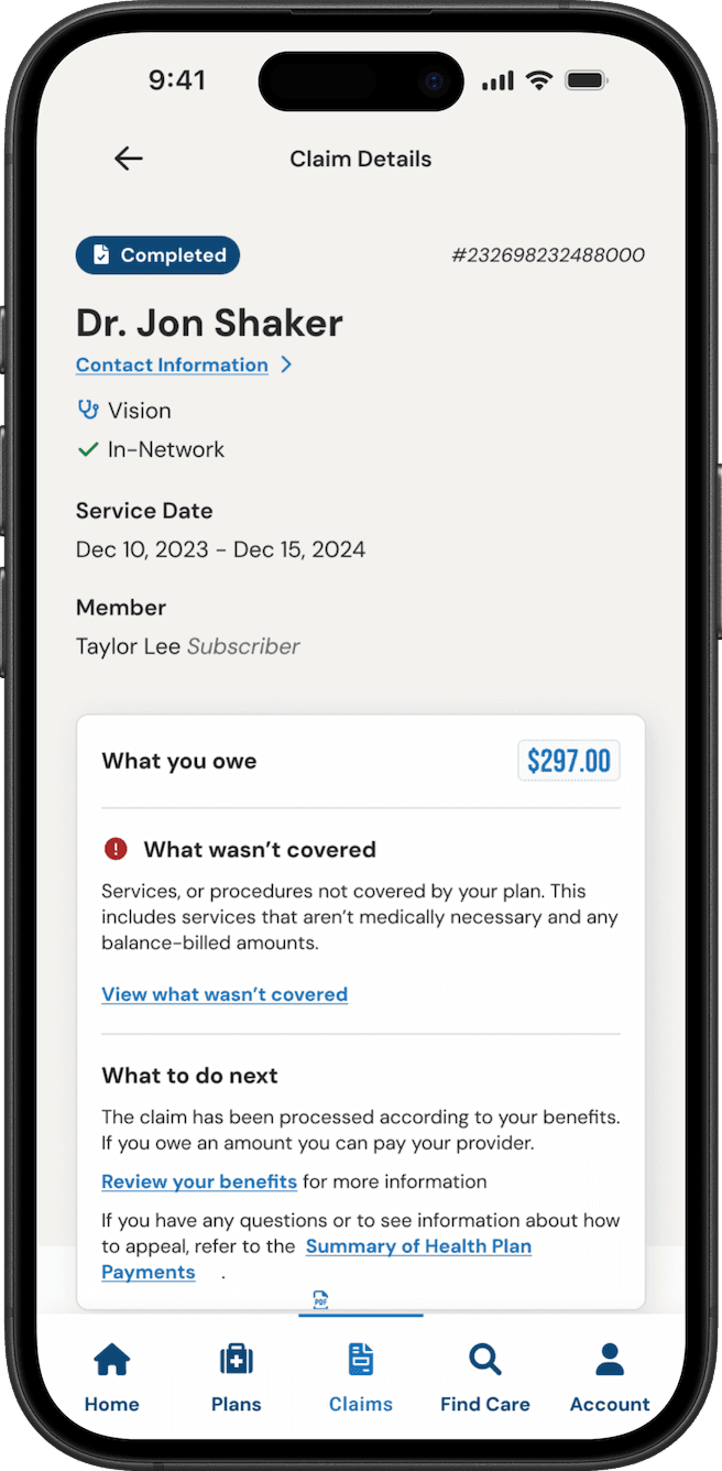
BCBSMA has a strong, established brand built on bold orange, all-caps type and desaturated photography of smiling people. This brand language works quite well in marketing materials and campaigns and gives the organization a distinct visual style.
However, in an insurer’s app, this brand language can be perceived in the wrong way when a member’s claim is denied, when an unexpected bill arrives, or in other situations where someone using the app might already be severely stressed.
Solution
A calmer interpretation of the brand inside the product
Leveraging direct member feedback from our up-front research, my team advocated for restrained use of imagery, warm colors that are less associated with clinical settings, and typography tuned for comprehension rather than marketing impact.
Legacy app, using brand colors and typography (left) compared to our redesign (right)

02: Searching for care
Not every UX problem is a UI problem
Throughout the project, some stakeholders questioned whether some of the redesigned areas of the app were “different enough” from the legacy app. Their perspective is understandable - they wanted to ensure the new app was more than just a surface-level reskin.
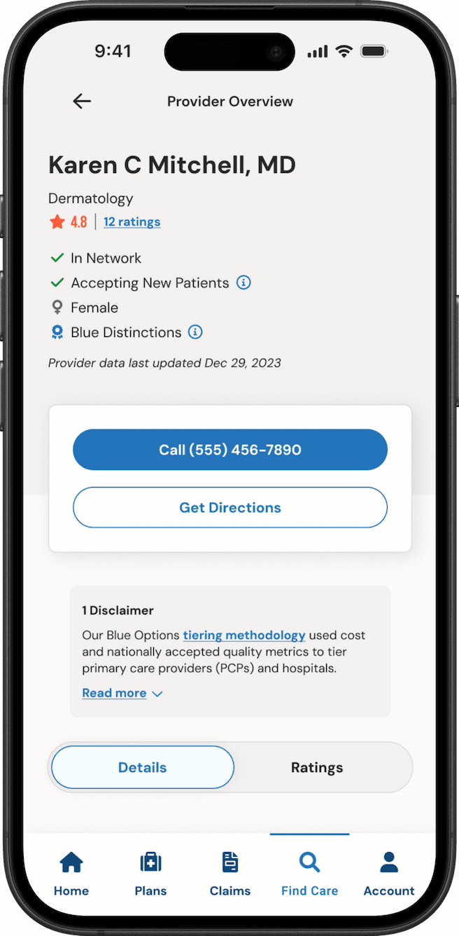
The redesigned Find Care flow was one such area. The underlying interaction model was straightforward in both the legacy app and the redesign: confirm the member, plan and location, then search by provider, specialty, condition or keyword. The new flow was clearer and modern, but the progression from screen to screen was similar to the legacy app, and stakeholders wondered why, when members complained about the search feature.
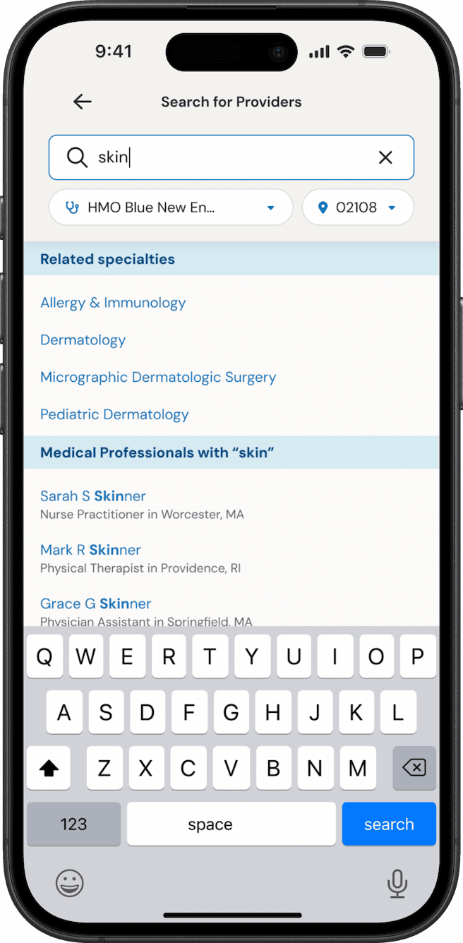
Digging into member feedback pointed somewhere else. Searches that weren’t an exact match returned nothing, so a member looking for an eye doctor might not see optometrists, or a member searching for “rash” might not find dermatologists.
Solution
Shift the focus from the UI to the underlying search technology
I helped move the conversation from "the flow needs to be different" to "how does search understand intent?" The BCBSMA team added fuzzy and keyword-associated search, and the interface shows it as related specialties.
Legacy search returning no results (left) compared to the redesigned search suggesting related specialties (right)

03: Accessibility foundations
Accessibility as a core requirement
Accessibility couldn't be a pass at the end of the project. Engineering was right behind each sprint, so it had to be built in as we went.
I considered color contrast, reading level, touch targets and assistive technology throughout design. I also wrote accessibility guidance for each major feature, including screen reader focus order and announcement behavior for the iOS and Android screen readers. That meant defining what a screen looked like and also what a member using assistive technology would hear, and in what order.
Color contrast
Plain-language reading level
Touch-target sizing
Screen reader focus order
Announcement text, in order
iOS & Android accessibility specs
The visual layout vs what a screen reader perceives


Impact
A fully redesigned app with stellar ratings and a strong design foundation for future growth.
/
Apple App Store rating, up from roughly 1.8, with 12,000+ ratings as of October 2026.
Speed and scale
Redesigned and launched in under 10 months by a two-person design team, across about ten feature areas.
More than a refresh
The result was more than a visual refresh. It gave BCBSMA a clearer, calmer and more accessible touchpoint with members, and a design system for continued growth and expansion for future member needs.

